Brand identity for the Welly Giving Week 2023 which was a wonderful success enabling 16 more young people a life-changing Prince Albert Scholarship. This is an incredible achievement and will change the lives of these young people, their families, friends, and the wider Wellington Community.

A new simplified brand identity, as part of a wider re-brand project, for this independent prep school in Hampshire. The shield represents two fords ('twy-ford) and the main Twyford Road.

Identity for Warwick Schools Foundation who run five independent schools and provide a ready forum for their Heads of School to share best practices. The Foundation provides space and resource for forward thinking amongst peers and the simple power of joint focus enabling transformation through the power of education.

An identity refresh for Tonbridge School as part of an overall re-bran project.

Identity for the inaugural Benenden Giving Day in support of their bursary campaign. The friendly heart design solution is also a B for Benenden.

Brand identity for Fluid who design and create the workplaces of tomorrow. From relocation to refurbishment to fit-out, they do not compromise on quality or detail their tailored approach and dedicated team ensure that the whole process flows seamlessly from design to delivery. Fluid by name, uncompromising by nature.

Roanne Orlebar Designs is all about personalisation, offering a range of nightwear for adults and children, as well as beautiful handmade cushions.

Petras Property is a small, specialised team that deal in long-term lettings and management covering South West London.

Brand refresh for Club Workspace, the fast-growing network of creative co-working spaces throughout London, delivered by Workspace Group.

When the Girls Day School Trust rolled out their new brand identity NHEHS also took the opportunity to review their brand. The new identity draws influence from one of their early school traditions of the girls using cross-stitch on their school blouse collars and cuffs.

A more modern treatment for St Pauls with simplified crest and new typography.
'Inspiring Education' is the umbrella name for the school's masterplan for the next 10 years. Abbreviated to ie. there are three strands to the fundraising campaign bursaries, buildings and special projects that enrich the curriculum.

A simple modernisation of the schools brand identity by cleaning up and simplifying the crest and introducing a new typeface.

Brand identity for Frost, our friends and neighbours here in the Light Bulb. Frost is a design studio practising in architecture & interiors with a reputation for bringing creative solutions to difficult sites together with the technical knowledge to deliver building projects.

Brand identity for the new Sherborne Girls performing arts centre, named after Gwendoline Merritt, a much-loved member of the housekeeping team who left her estate to the school.

Brand identity for the Sherborne Girls Sports Centre, brought visually into line with the arts centre.

When the Duke of Wellington withdrew usage of his coat of arms from the College, we created a new simplified brand identity based upon one element of the original, but altered enough for it to be approved and registered with The College of Arms.

Brand identity for the Colleges alumni giving circle based on the three Wellington colours.

Sub-brand identity and positioning for the Wellington College Community, used on all their comms.

Brand identity celebrating the first twenty years of the Foundation.

Campaign identity for the Sherborne Foundation who are raising funds for bursaries and various capital projects supporting all-round educational excellence at Sherborne School.

Naming and identity project for the RGS Old Guildfordian magazine. The design solution speaks for itself.

New brand identity for The Foundry, a London gym created by elite sportsmen and women to offer world class training for everyone. In addition to elite personal training and some of the best classes in London, they offer educational courses, seminars, workshops and community training sessions. The new identity reflects their hardcore ethos of fitness, not fluff!

Brand refresh for Caterham School, one of the top independent co-educational schools in England. The badge has been re-drawn and refined and was the start point for a whole new suite of marketing materials.

Campaign identity for the Reeds School, Cobham development programme, which aims to raise funds for their Foundation and to provide the facilities key to the future of the School.

Brand identity for Ploutos International, an independent and dynamic advisory boutique providing corporate and wealth solutions primarily to corporates, funds, trusts, families and family businesses.

The Skinners Company is one of the Great Twelve livery companies of the City of London. It developed from the medieval trade guild of furriers and was incorporated by Royal Charter in 1327. Today it is a major not-for-profit organisation involved in running schools, sheltered housing and grant programmes for individuals, educational institutions, and a wide range of small organisations throughout the UK. We have recently refined and re-drawn their coat of arms in which all elements are sacrosanct granted by permission of Royal College of Arms in 1500.

Brand identity for a business specialising in hooking the right talent. They provide search-led and bespoke resourcing solutions to help businesses grow and meet their goals.

Invenior Group find, reach and connect with the talent businesses need to transform, change or grow their organisations. The design solution for the brand identity reflects their Financial Services sector specialism.

Naming and identity for a maker and purveyor of high quality and award-winning pies. Blessed are the pie-makers!

Identity for Kings development masterplan programme of infrastructure projects over the next 510 years.

Identity for an independent start-up nano-brewery specialising in craft beers. The design picks up on the heritage of the brick making industry in Burgess Hill, where they are based.

Brand refresh for Rosbery, a highly successful girls comprehensive school in Epsom. The school was founded by Neil Archibald Primrose, 7th Earl of Rosebery.

Identity for a start-up business who create bespoke software solutions for specialist financial markets.

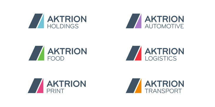
New branding programme for Aktrion, an international business and manufacturing support services provider, offering expertise in the Automotive, Food, Logistics, Print and Transport sectors, helping their clients to improve performance and service levels, reduce costs, and maximise flexibility. We not only created a cohesive and consistent brand identity, but also helped them to understand and communicate their business structure in a much more succinct way. Their brand profile has been elevated and their customers are now clearer on the expertise they offer.
Fabric is a start-up people development business that works to get into the fabric of an organisation in order to gain an understanding of current and future needs. Armed with this information, they develop culture, values, best practice and training strategies. The visual language around the brand identity will utilise the equals graphic for all key messaging.

A new identity to encapsulate the nature of the society: the promotion of friendship and the sharing of cultures between Britain and Spain. A fresh, colourful and approachable logotype, integrating the two cultures through their flags whilst subtly representing the B of British and the S of Spain.

Brand identity for a new campaign launched by The Foundation at Reigate Grammar School. The 1675 Bursary Fund aims to enrich young peoples lives by offering the life changing opportunities that come through an RGS education.

Brand identity for a new homeware and gift shop, with adjoining traditional tearooms, in Chipping Camden in the Cotswolds. The design solution features a weaver bird, well-known for being house proud.

Our design solution for the Allied Security identity reflects the solid nature of what they do - specialists in the manufacture and installation of roller shutter enclosures and security doors for the rail industry.

Brand identity for Workspace Group, the leading provider of small business space across London. The circles design solution is an evolution of the previous identity and represents growth, innovation, inspiration, collaboration and community. The identity appears in 9 colourways to reflect the wide array of different character properties within their extensive portfolio.

An evolution of their existing 'badger' icon, resulting in a new identity which is contemporary, smart and stylish without losing its friendly and approachable personality.
Identity for E3 Workspace Groups community investment strategy enabling engagement between: education, employment and entrepreneurship.

KX, pronounced kickz, represents
a way of life where health meets lifestyle. KXGymUK is an exclusive private members health club in Chelsea and is regarded as the flagship for the KX brand. The ethos is a dedication to developing new and exciting luxury products and services that they hope will become a way of life for their customers.

EAB is the start-up European operation and wholly-owned subsidiary of Arab Bank, one of the largest financial institutions in the Middle East. Working alongside our strategic business partner, Gabriel Research & Management, we created a distinctive visual identity.

Brand identity for a series of exclusive Financial Forums at the London Stock Exchange, hosted by Europe Arab Bank, to provide participants with valuable insight, outlook, commentary and networking opportunities.

Brand identity for LMCU a financial
co-operative that provides its members with flexible savings and loans.

Name generation and brand identity for a new internet banking service - a visually strong solution with a clear and direct message.

Using traditional pub graphics, we created a strong identity with individual character to represent this group of pubs and bars. The Only Pub Company now has the necessary credibility with which to approach breweries, property companies and banks.

The 5-star Amber Valley resort, strategically located on the shores of the world renowned Dead Sea area, 1,300 ft below sea level, is expected to be the first truly integrated, luxury, eco-conscious resort of its kind. The proposed identity is stylishly simple with the flexibility to be adaptable for the various sub-brands.

Brand identity for a community event to be held on Ealing Common, West London - a British tribute to Polish heroism, friendship and culture.

Brand identity for a specialist financial services regulatory consultancy, providing a full range of consultancy advice, reviews and compliance support services to firms regulated by the Financial Services Authority (FSA).

A classically simple design concept provided the solution for the identity for this print, sales and marketing company based in Southend, Essex.

Brand identity programme for an art gallery group based in St. Jamess. The key to answering the brief successfully was to come up with a flexible design solution that could work as one overall brand or three individual brands.

An identity programme for a leading specialist provider of recruitment services in the Information Technology and Communications (ITC) sectors.

Lambeth, Southwark & Lewisham was the first Health Action Zone to adopt a smoking cessation programme. We came up with a name, brand identity and a whole range of supporting marketing materials for this initiative.

The brand identity for this publisher of beautiful art books and stationery, was designed to reflect the simplistic woodcut style of early chapbooks.

A spark of creativity was needed to create the brand identity for this electrical installations company.

Naming and brand identity for a website offering business advice to small and medium-sized enterprises.

Brand identity for a company operating specialist guided tours to French and Belgian battlefields.

Brand identity for a new company established as a response to the significant and continuing changes to the structure of the asset management industry.

Name generation and brand identity for a web-based comparison site offering all types of commercial property for rent.

A design solution packed full of wit for the brand identity for this upmarket mobile catering company.

The e-bar is a sumptuous tapas and cocktail bar beneath The Colonnade,
part of the Eton Collection group of hotels. The illustrative identity reflects the vibrant culture of Spain.

Brand identity for Scootamatic, a division of Niagara Healthcare, providers of healthcare equipment for over 30 years.

Classically elegant brand identity for an upmarket designer and manufacturer of bespoke jewellery.

Brand identity for the Helbeck Estate, a family-owned and managed shoot nestling on the edge of the Pennines with spectacular views over the Upper Eden Valley in Cumbria.
